.png?width=1920&height=410&name=RamBase-Logo-Standard-Dark%20(5).png)


Press & Brand
RamBase's visual identity is designed to reflect who we are as a company and what we do. This page brings together our logo, colours, typography, and imagery, so you can represent RamBase consistently wherever you're telling our story.
Content made on behalf of RamBase should always be brought to our marketing department's attention for revision and approval.

-min.png?width=3833&height=2560&name=aksdal_STOCKS_2022_WEB%20(66%20of%2070)-min.png)
The RamBase logo
To ensure optimal visibility and brand consistency, we recommend adhering to the following best practices when utilizing our logo. When placed on a white background, use the dark version of our logo to maintain clarity and readability. Conversely, on dark backgrounds, opt for the white version to achieve a striking and polished appearance. It is essential to refrain from using the white logo over busy or intricate images, as this may compromise its visibility and impact.
By adhering to these guidelines, you not only enhance the legibility of our logo but also contribute to a cohesive and professional representation of our brand across various platforms and media.
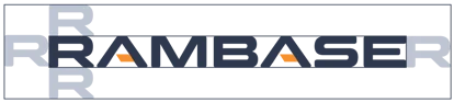
Logo spacing
Logos generally work best when they have room to breathe. The RamBase logo must always have air equal to, or more than the width and height of the letter ‘R’, as shown below.